
You’ve just walked into a cluttered room, and every surface is crammed with stuff (a bit like Graham’s desk tbh). Feels a bit overwhelming, right? But if you went into a room with just a few well-placed pieces, it would likely feel much better. That’s exactly what white space on your website does – it gives your content room to breathe, making everything easier to see and digest.
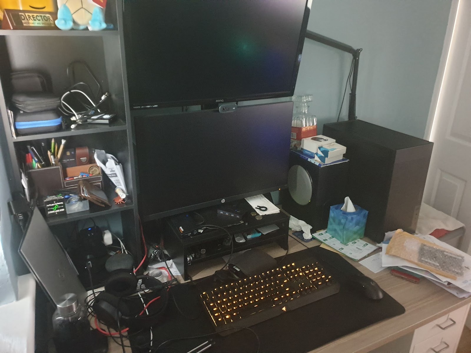
(That is genuinely Graham’s desk, and it gives Heather anxiety.)
What do we mean by white space?
Let’s clear something up first: White space on your website isn’t necessarily white. It’s just the term nerds like us use to describe the empty areas on your website – the gaps between your text, images, and buttons. Think of it as the margins in a book or the spaces between paragraphs in a letter. It’s the invisible structure that keeps your content from turning into one big, messy jumble. We’ve made a couple of social media posts recently to try and drive this home. This is what we mean by “not having enough space”:
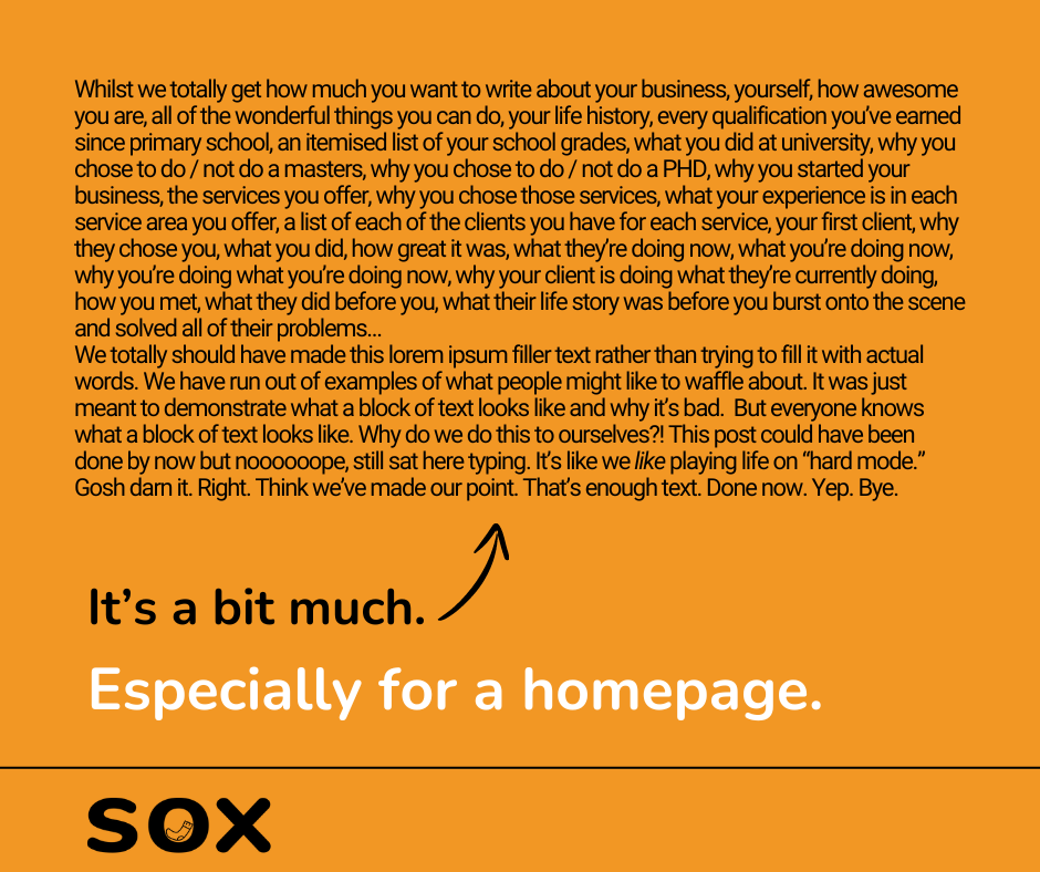
We bet you haven’t even read that. You just saw the massive block of text and thought “urgh, no thanks.” Well if your website feels like that, then your website visitors will do the same thing you just did. They won’t bother to read it. They’ll likely feel lost and / or overwhelmed, and just leave.
Why white space on your website matters
You likely think all that space is just wasted real estate (actually, we know for certain that a number of you do feel that way, because you’ve said so in our free advice calls), but it’s actually one of the most powerful tools in web design.
Imagine trying to read a wall of text with no breaks – like our social media post, above. It’s just totally off putting (shame, really, because we spent quite a bit of time writing the utter drivel that went into that image). Space helps to break up your content into manageable chunks, making it easier for visitors to read and understand what you’re saying.
White space on your website also helps draw attention to what’s important. By surrounding your key messages or calls to action with space, you make them stand out. There’s nothing distracting from them. Your visitors won’t have to hunt through clutter to find the ‘Contact Us’ button, or your latest blog post.
What’s more, we all know that short attention spans are a real problem. Hiding the important things (like that “contact us” button”) in a sea of stuff is going to put you at the mercy of those short attention spans – and that’s a fight you likely won’t win.
So spread it out, break it up, and make it easy to find.
Have you ever noticed how high-end brands use lots of space on their websites?
It’s no accident.
Want us to prove the point? Well, OK, we’re happy to go look at what we can’t afford in the name of research. If we must…
Here’s Aston Martin’s homepage:
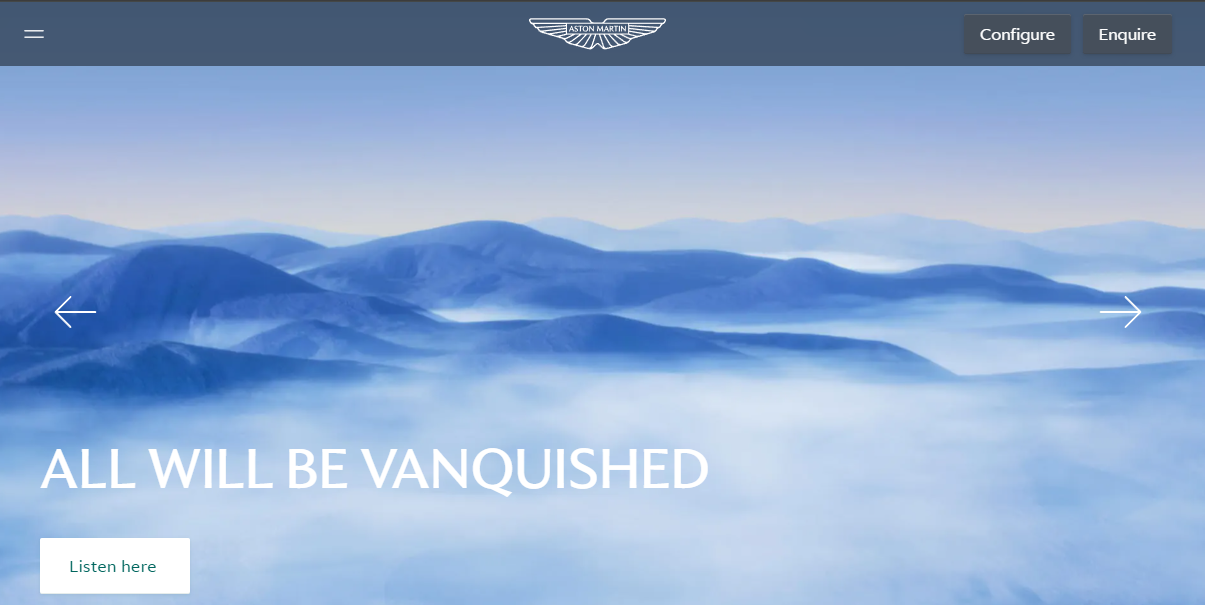
That’s literally all that’s at the top. No clutter. Not even a picture of a car (to start with, to be fair it does change after you’ve been on the page for a bit).
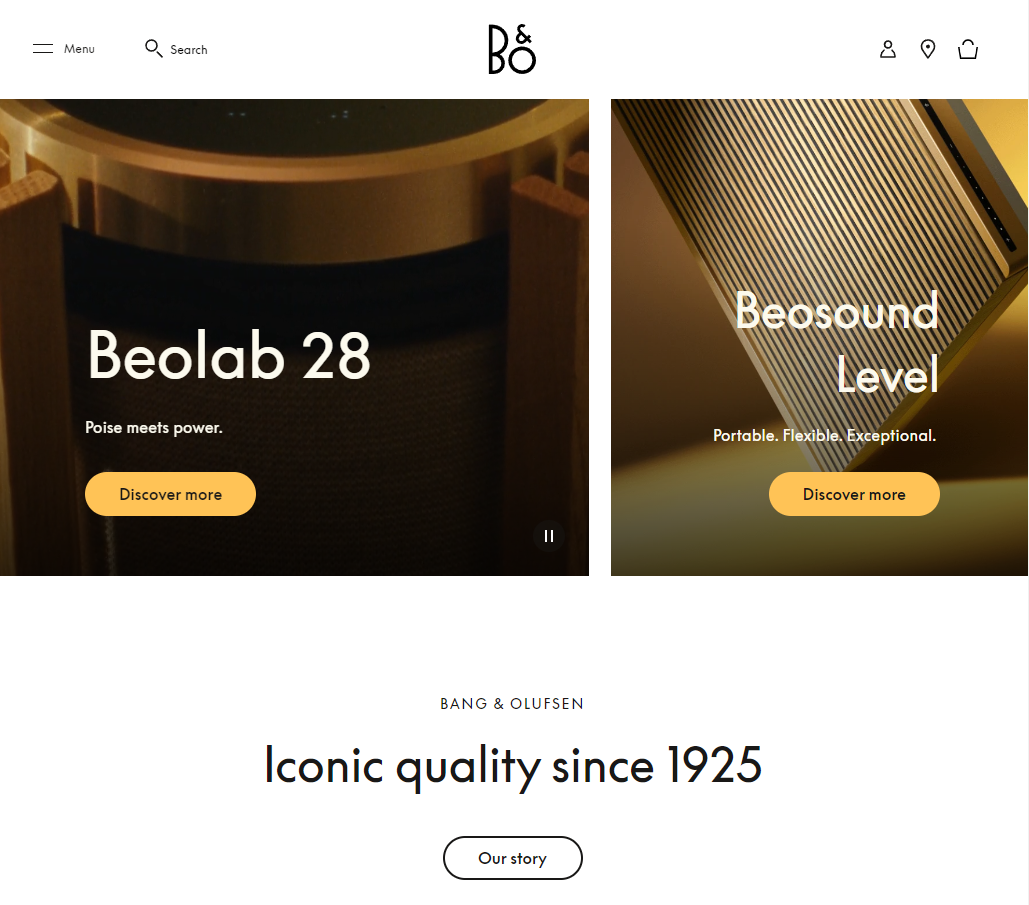
Or what about a seriously good speaker from Bang & Olufsen?
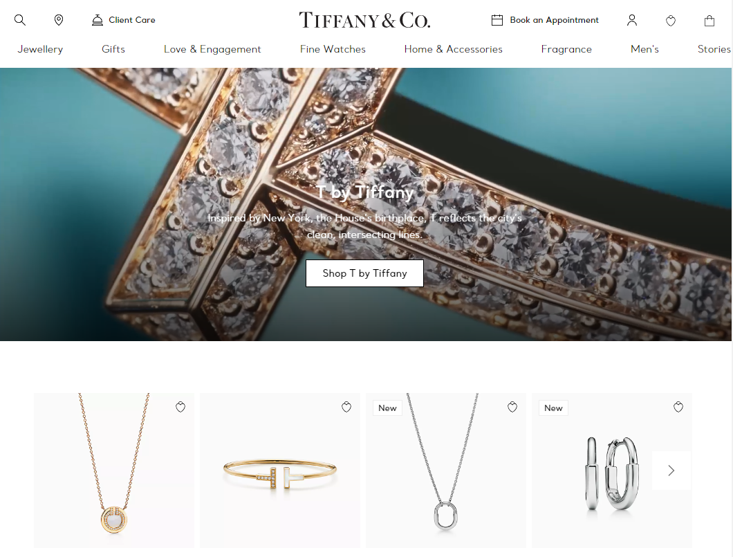
Or maybe some jewellery from Tiffany?
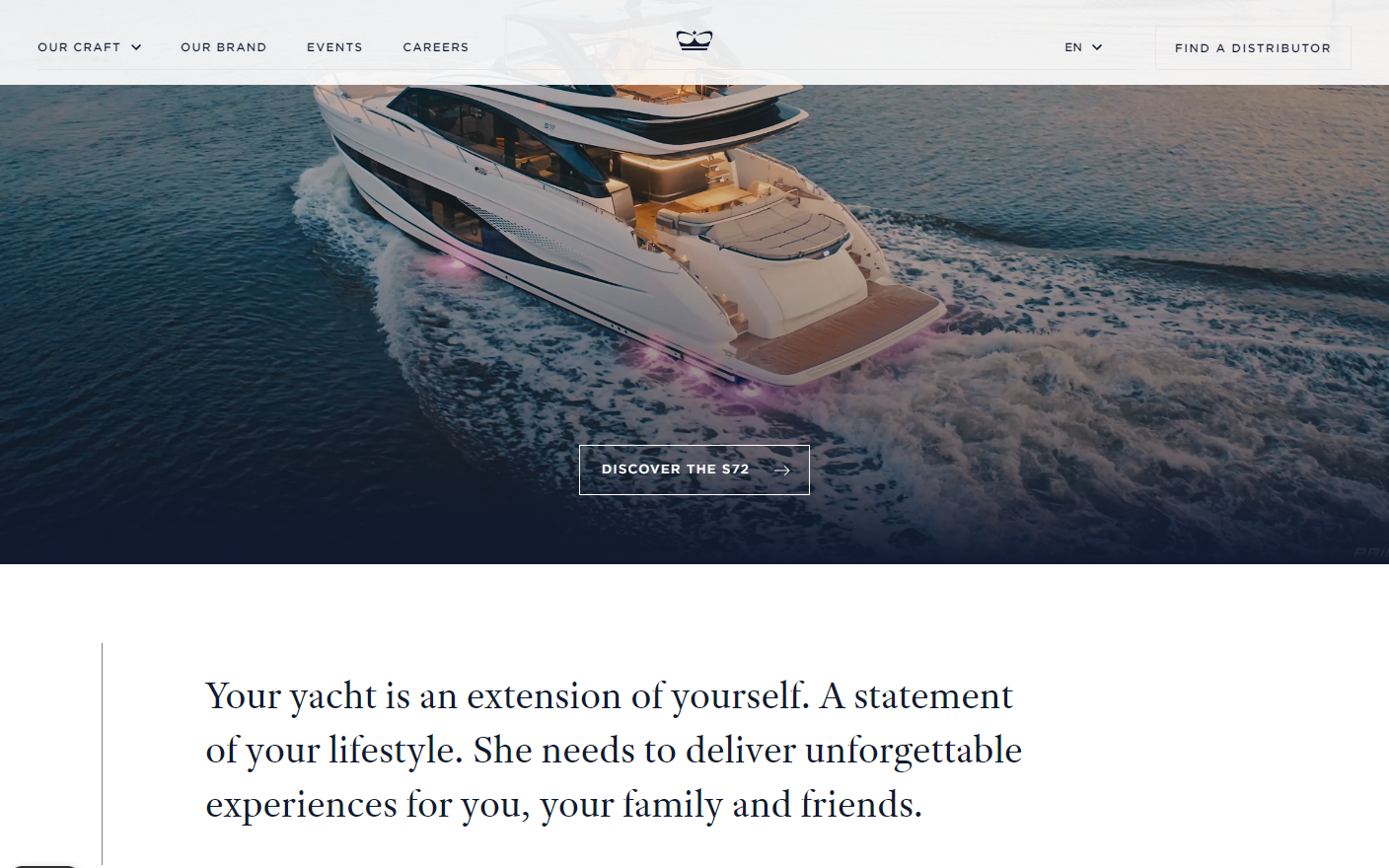
Or perhaps we can entice you with a yacht from Princess Yachts? (Pocket change, we know.)
Gucci is another great example; the top of their website is a single image, and then you only get two more when you scroll down the page.
Notice what they all have in common?
Not one of them is writing you an essay, or trying to get you to read paragraphs of content, or look at piles of products on their homepages. Granted, these guys probably don’t need to tell you what they do. They’re big enough, and well known enough, that that’s unnecessary. You don’t necessarily have that luxury, but white space on your website is still critically important. It adds a touch of sophistication and helps create a clean, modern look.
How do you go about adding white space to your website without making it look empty?
Start by making sure there’s a good balance between text and images. Too much of either can make your page feel cluttered. Use white space to give each element its own place, so everything doesn’t compete for attention (an “element” is what you call the collection of images, headers, buttons, headers etc.).
We totally understand that it can be a delicate balancing act – having enough white space on your website to break up content, vs. not so much space that the site is half empty. This is where prioritising your messages comes in. Decide what’s most important on each page, and use white space to highlight your key messages and guide visitors through your site. For example, if you want people to sign up for your newsletter, don’t bury the sign-up form in a sea of text – give it some breathing room.
Don’t be afraid to use generous margins and padding around your content as well. This extra space can make your website feel more open and inviting, reducing the risk of overwhelming your visitors.
When it comes to buttons and links, less is often more. We’re fans of buttons to help promote your user journey (dunno what a user journey is? We’ve got a blog on that), but instead of cramming every possible call to action onto a single page, focus on one or two key actions. Surround them with white space to make them pop and guide visitors towards taking the next step.
As you work on your website, don’t be afraid to leave a little room around the edges. Your visitors will thank you for it.
Think you’re screwing your website up?
Maybe you’ve built it yourself and you think it looks half empty, or you’ve removed everypossiblebitofspace you can and still can’t work out what looks wrong. If you just need some help and an outside point of view of what you’ve done well, and what needs attention, drop us a line. We can help you under our free advice offer so it won’t cost you a penny.